How to Write an AI Prompt for a T-Shirt: The Five-Part Formula
Custom tee $35.85Ready-made from $19.99Printed in 5–7 working daysFree worldwide shippingNo minimum
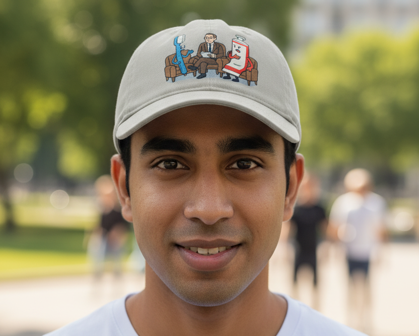
A cap printed with a design generated from a single typed prompt
A prompt that produces a beautiful image often produces a bad t-shirt. Those are different jobs. A screen has backlight, infinite colours and a viewer six inches away; a shirt has fabric texture, a fixed palette and a viewer three metres away who gets about two seconds to work out what they are looking at.
Almost every failed apparel prompt fails in one of five places. Fix all five and the hit rate changes dramatically.
The formula
Subject + Style + Composition + Palette + Background
Every one of those does specific work. Leave one out and the model fills the gap with an average of everything it has seen, which is exactly the generic result people complain about.
1. Subject — one thing, doing something
The single biggest upgrade available to most prompts. "A cat" is a description. "A cat in a wedding dress marrying a duck" is an idea, and ideas are what people wear.
Keep it to one subject. A single clear character reads from across a room; a busy scene with three characters and a landscape becomes a smudge at chest size. If your idea needs a second sentence to explain, it needs simplifying, not more pixels.
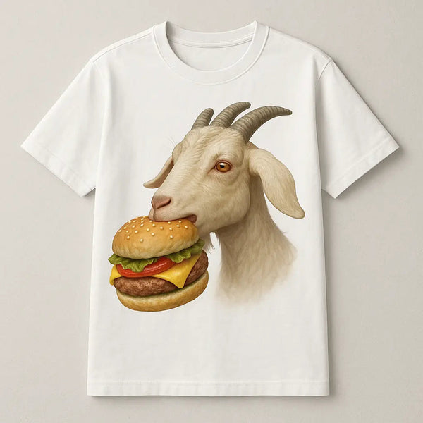
Give the subject an action or a situation. Static subjects produce stock-image results. A goat is nothing; a goat eating a burger is a shirt.
2. Style — name it explicitly
This is the part people skip, and it is why output looks like mediocre digital art: the model defaults to an average of its training data unless told otherwise.
Useful styles for apparel, each producing genuinely different results from the same subject:
- Flat vector illustration — clean edges, solid fills. Prints the most reliably of anything on this list.
- Bold cartoon, thick outlines — forgiving of fabric texture, reads well small.
- Vintage screenprint, limited palette, slight distress — the retail-merch look.
- Line art, single colour — minimal and cheap to print well.
- Linocut or woodblock — high contrast, excellent on single-colour prints.
- 1990s streetwear graphic — heavy type, high contrast, gritty texture.
Avoid photorealism. It needs enormous tonal range to look right, and fabric flattens exactly the subtle mid-tones it depends on.
3. Composition — tell it where things go
Say centred composition, subject isolated, full body in frame. Without this you get arbitrary crops, subjects running off the edge, and compositions built for a landscape screen rather than a vertical chest panel.
If the design includes words, say so explicitly and put the text in quotation marks: with the caption "Recharging…" underneath in bold sans-serif. Models still garble unrequested text; quoting it and specifying placement markedly improves the odds.
4. Palette — limit it deliberately
Ask for a limited palette of three or four colours, high contrast. Restricted palettes look more designed, print more cleanly, and survive the shift from backlit screen to matte cotton.
Then check the design against the garment colour, not against your editor's white canvas. Pale cream on a white shirt disappears. Navy on a black hoodie disappears. This catches people out constantly — name the shirt colour in the prompt so the model composes for it.
5. Background — always specify
End with plain white background, no scenery, no shadow, or transparent if your tool supports it. Skip this and you get a full illustrated scene that prints as a visible rectangle of background sitting on the fabric — the single most common reason a design looks amateur on a finished garment.
Before and after
| Weak prompt | What comes back | Rewritten |
|---|---|---|
| a cool dog | Generic photo-ish dog, cluttered park background | A golden retriever wearing sunglasses driving a convertible, bold cartoon style with thick outlines, centred composition, four-colour palette, plain white background, no scenery |
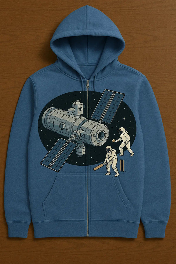
| space design | Nebula wallpaper, unprintable gradients | An astronaut playing cricket on the moon, flat vector illustration, centred, three-colour palette of navy, white and orange, plain background |
| funny coffee shirt | Clip-art mug with garbled text | A sleeping battery icon with the caption "Recharging…" below in bold sans-serif, minimal line art, single colour, centred, plain background |
| vintage sunset | Photographic gradient that bands on fabric | A retro sunset with horizontal stripe bands, 1970s screenprint style, distressed texture, four flat colours, no gradients, centred, plain background |
Words that quietly ruin a print
- "Photorealistic" — needs tonal subtlety fabric cannot hold.
- "Highly detailed", "intricate", "8K" — produces detail that vanishes at chest size and muddies the read.
- "Soft gradient", "glowing", "bokeh" — gradients band on dark garments and glow needs backlight that fabric does not have.
- "Cinematic lighting", "dramatic shadows" — imports a background scene you did not ask for.
- "In the style of [living artist]" — legally murky and ethically contested. See our guide to copyright on AI-generated designs.
- Named characters and brands — a fast route to a takedown.
A worked example
Start: "turtle shirt"
Add subject and action: "a turtle giving a TED talk on patience"
Add style: "…bold cartoon style with thick black outlines"
Add composition: "…centred, full body, subject isolated"
Add palette: "…four-colour palette, green, cream, black and red, high contrast"
Add background: "…plain white background, no scenery, no shadow"
Six small additions, and the result goes from a clip-art turtle to something that survives being printed and worn.
Iterate on one variable at a time
When a result is close but wrong, resist rewriting the whole prompt. Change one thing — the style, or the palette, or the composition — and regenerate. Rewriting everything at once means you never learn which word was doing the damage, and you will make the same mistake on your next design.
Our generator has tweak controls for exactly this reason: bigger, smaller, brighter, simpler, applied to the design you already have rather than starting over.
Then check it will actually print
A perfect prompt still produces a file, and files have their own failure modes — resolution, transparency, thin lines. Before ordering anything, run through why AI designs print blurry, which covers the arithmetic that decides whether your design arrives sharp or soft.
Want to skip the file-handling entirely? Describe your idea in our generator and the artwork comes out at print resolution, ready to go on a t-shirt, hoodie or cap.